Xcess Addiction Coffee

The goal of this light-hearted project was to design satirical packaging for a fictional coffee pod company, Xcess Addiction. A commentary on the excessive and unsustainable nature of the pods, as well as our society’s addiction to coffee, this design calls on tropes of the 80s and 90s—decades defined by both excess and addiction.

Website+Textures-14.jpg
Screen+Shot+2019-02-23+at+9.19.33+PM.jpg
Wrap+around.jpg

Concept
While ideating, I thought about not only the lack of sustainability of the product, but the excess built into the concept itself—brewing an individual cup, purchasing a variety to suit preferences, and the increased amount of packaging. I also considered the role coffee plays in our culture, as a necessary part of functioning, as an addiction. I wanted to ensure my design encompassed both of these ideas and immediately thought of the 80s and 90s—decades defined by both excess and addiction. 

Background & Concept

Background
Coffee pods are criticized for being excessive and wasteful, with billions sold annually and an untold environmental impact. In 2015, Kurig alone sold 9.8 billion non-recyclable k-cups that will each take 500 years to breakdown. North America and Europe continue to lead the world in coffee pod consumption, with global growth in the double digits for a number of years. (That has since slowed to single digits in 2015.) Annually however, Americans are still drinking more coffee, with 50% of the population (150 million Americans) drinking at least a cup each day. On average, we actually drink over 3 cups a day.

cup tops.png
Website+Textures-14.jpg
 
Screen Shot 2019-02-23 at 9.41.00 PM.png
Screen Shot 2019-02-23 at 9.41.12 PM.png
 
 
Screen+Shot+2019-02-23+at+9.19.33+PM.jpg
 

Process

Screen+Shot+2016-04-25+at+8.23.21+PM.jpg

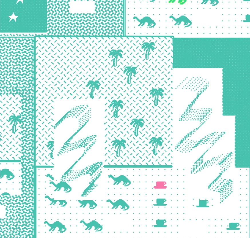
Expanding on the idea of genre-specific excess, I chose to design an excessive amount of packaging—two boxes, one carrier, and a bellyband—all for only eight coffee pods. I wanted to lean into the tropes of the 80s and 90s with gradients, brush stroke fonts, glow effects and drop shadows, and computer graphics beautiful pixelated. The goal was to lend itself to the era without directly replicating it.

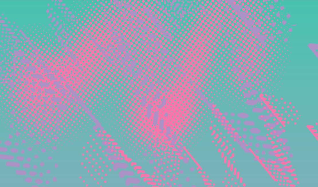
While putting together a mood board, I was drawn to vaporwave aesthetic and my own childhood nostalgia. This was manifested in the color palette and texture, the latter of which was created in a browser version of the early 90s computer program, KidPix. I also wanted to lean into the excessive design of the boxes by putting texture everywhere and printing the inside of the boxes as well—everywhere the customer interacts with the package, they should be bombarded by color and shapes.

Texture studies created on KidPix.

Texture studies created on KidPix.

Mood board.

Mood board.

 
Website+Textures-14.jpg
 
 
Screen Shot 2019-02-23 at 9.41.00 PM.png